Welcome to Shelf Candy Saturday!
This is my weekly feature
showcasing beautiful covers!
It also provides information,
if available, on their
very talented creators!
if available, on their
very talented creators!
Here's my choice for this week!
Grimenna
N.K. Blazevic
Trade Paperback, 304 pages
EDGE Science Fiction and Fantasy Publishing
April 11 , 2018
Fantasy
N.K. Blazevic
Trade Paperback, 304 pages
EDGE Science Fiction and Fantasy Publishing
April 11 , 2018
Fantasy
My Thoughts About This Cover
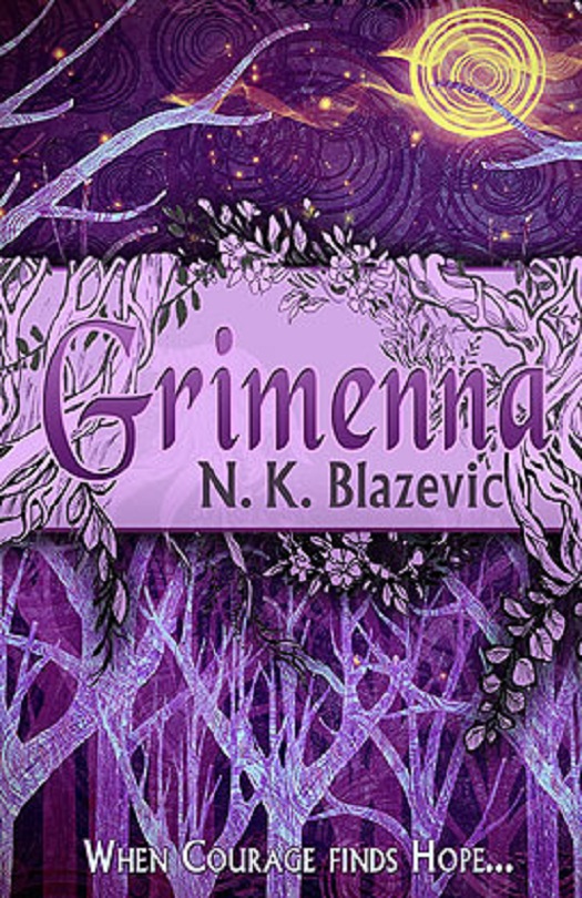
This is what I call "a split-level cover", which is a style that doesn't usually appeal to me. This one, however, is so seamlessly put together that it totally works!
First off, I LOVE trees. I love interlacing branches, and I love the details of leaves and flowers. And, of course, I'm a tree hugger! So I love the way these branches start out at the bottom of the cover, and work their way to the top.
The colors are perfect for the fall season, too. The shades of brown and tan are very well integrated into the image, and those eerie, glowing tree branches in the bottom third of the cover are totally striking!
The top third of the cover features a very strange, round object that must be the moon, although I've never seen the moon depicted in this manner before. It's basically a series of concentric circles.
Lastly, there's that superb title! The font has a definite medieval flavor, and I think the title itself refers to the stories of the Grimm brothers. Very clever, indeed!
This book is currently available, and it's calling my name, so I think it will soon join my bulging shelves, lol.
As for the cover artist, she is Canadian Ella Beaumont, and she worked for EDGE Science Fiction and Fantasy Publishing from 2011 to 2016, first as a freelance editor as well as in sales and marketing, and then as a book packager (this is where she obviously designed some covers, too) and Acquisitions Editor.
It was in 2016 that she decided to go off on her own, working on her own editing and writing endeavors. She attended the Art Institute of Vancouver, Canada, from 2009 to 2010, studying Animation Art and Design.
I certainly hope Ms. Beaumont continues to design book covers, because she's really GREAT at it!


Another striking cover. Your observations about it are insightful Maria. I agree, that moon is different but very effective. Its color makes such a contrast with the remainder of the picture. I also love the violet color that predominates the entire cover.
ReplyDeleteHi, Brian!
DeleteThanks for the compliment!! <3 <3
I just LOVE unusual covers! And yes, that moon is very effective, although it's weird. Lol.
You're right about the violet -- it's right underneath the tans and browns of the cover. Another unusual, and also effective, part of this design!
Thanks for your interesting comment!! <3 :)
Holy crap, that's one beautful cover! It kinda reminds me of this art project we needed to do in elementary school where we had to go in a group of a couple of kids and draw a tree with branches. Also love the colors!
ReplyDeleteHi, Steph!
DeleteYes, it SURE is!! :)
Gosh, you were SO lucky to have such an art project in elementary school! I did have two art projects in high school -- one involving the "Canterbury Tales", in which the whole class created our own "Canterbury Tales", and then each students designed her own cover. (it was a Catholic all-girl school.) The other project involved creating our own Stations of the Cross, making them relevant to our daily lives by cutting pictures out of magazines. (The Stations of the Cross is a Catholic devotion used during Holy Week, before Easter.)
Yes, the colors are AWESOME!! Not my usual blue, but I love them anyway!!
Thanks for the lovely comment!! <3 :)
I really like this cover as well for all the reasons you mention, Maria. Like you, I love trees on a cover and I like the purple coloring. The split level is well done, I agree.
ReplyDeleteHi, Wendy!
DeleteGlad you like this cover, too!! <3 <3
Ohm, I'm a tree hugger!! Haven't hugged any lately, though, so I've got to get out there and hug some!
Yes, the violet underlying the tans and browns lends a special appeal to this cover. And the split level is actually elegant, I think. So glad you agree!
Thanks for the lovely comment!! <3 :)