

Welcome to Shelf Candy Saturday!
***Late Edition***
This is my weekly feature
showcasing beautiful covers!
It also provides information,
if available, on their
very talented creators!
if available, on their
very talented creators!
Here's my choice for this week!
Pride
Ibi Zoboi
Hardcover, 304 pages
Balzer + Bray
September 18 , 2018
Classics Retellings, Contemporary Fiction,
Diverse Reads, Romance,
Young Adult Fiction

Ibi Zoboi
Hardcover, 304 pages
Balzer + Bray
September 18 , 2018
Classics Retellings, Contemporary Fiction,
Diverse Reads, Romance,
Young Adult Fiction
My Thoughts About This Cover
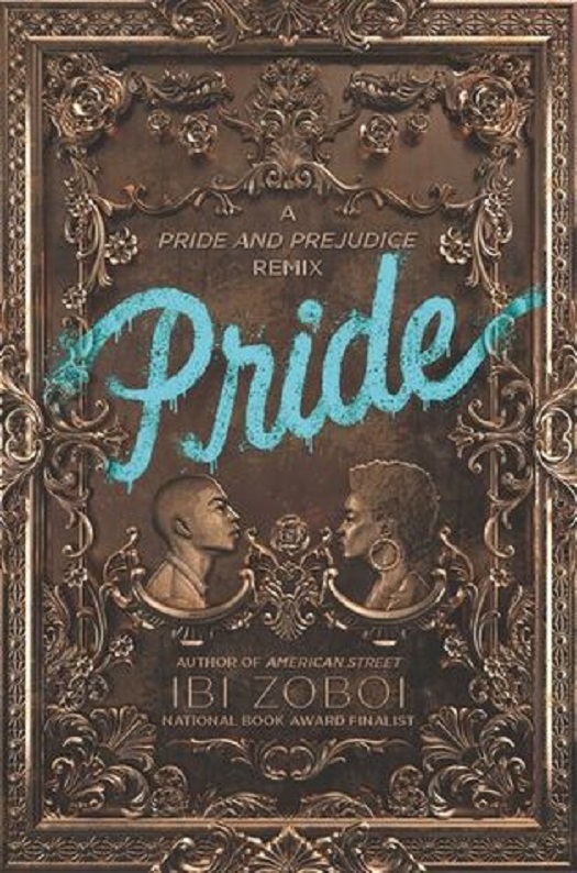
Well. This cover just totally FLOORED me! Absolutely! I have never ever seen anything like this before! It's not only STUNNING, but visually innovative. Music to my eyes! Lol.
The combination of elements here -- traditional versus contemporary, has created a powerful visual statement that depicts -- without words -- the whole concept of this novel.
The gilded, 19th-century-style ornamental design for the entire cover speaks of Old World money, while that bright blue, graffiti-style title refers to the brashness of contemporary street art styles that were born in "the 'hood". These are symbolic of two very different worlds colliding. It's a brilliant metaphor for the two very different people who are depicted in this novel -- a novel that revisits Austen's Pride and Prejudice in contemporary, New World terms.
I LOVE the cameo portraits of the protagonists -- Darius Darcy and Zuri Benitez. They defiantly stare at each other, as if daring each other to "try anything funny". The fact that there's a barrier between them -- an ornamental design, resembling a coat of arms -- is perfectly emblematic of the apparent gulf separating these two. Both of these romantic antagonists have a lot of pride, and it's very evident in their individual portraits.
I also LOVE the gilded design of the whole cover! It reminds me of traditional frames for Old Master paintings, as well as the designs included on Baroque ceiling paintings found in many European castles and mansions. It's SO very lovely!
There are actually three people responsible for this GORGEOUS cover. One of them is the cover designer, Jenna Stempel-Lobell. She works for HarperCollins. She details her search for the perfect combination of artists for this cover in the Spine Magazine article, referenced below. This search led her to realistic illustrator T.S. Abe, who created the cameo portraits, and Billelis, a freelance 3D illustrator and art director, who created the rest of the cover. Both of these artists are from the UK, and based there, as well.
T.S. Abe is a graduate of Central Saint Martins University of the Arts. Her detailed, brilliantly executed, and powerful, realistic drawings have been featured on album covers, exhibitions, and even a London bus. She has also exhibited at Electric Blue Gallery, and has been featured in Dazed and Confused Magazine.
Billelis (this is a pseudonym from his graffiti art days) is known for his intricately detailed style, just as powerful as T.S. Abe's drawings. He also tends to prefer macabre subject matter. Thankfully, nothing macabre is evident in this beautiful, graceful cover.
This is truly an AMAZING cover! The plot synopsis, which you can read on Goodreads, shows that the novel is just as amazing. I can't wait to add this book to my collection! Of course, the artists are already part of my ever-growing list of brilliant cover artists!
Online Links
T.S. Abe
Website
Escape Into Life Blog: T.S. Abe
Instagram
Spine Magazine
ArtFixx Blog: T.S. Abe
Billelis
Website
Escape Into Life Blog: T.S. Abe
Spine Magazine
ArtFixx Blog: T.S. Abe
Billelis
What do you think of
this week's cover?
Please leave a comment
and let me know!

this week's cover?
Please leave a comment
and let me know!
This really is striking. The cooper - brown works so well to impart that old world money feel that you mention. It seems almost the color of a penny or other coin. In addition the picture has a raised look like that if s coin. I also love the shade of blue that the word “Pride” is written in.
ReplyDeleteHi, Brian!
DeleteOh, DEFINITELY!! And you make a great point about the color of the cover! It DOES have the same color as a penny. And yes, you can tell that the design is raised. Billelis specializes in 3D design, so that's probably his contribution.
I, too, like the shade of blue used for the title, as well as the look of graffiti art.
All in all, this is a very unique, STUNNING cover!
Thanks for the nice comment!! <3 :)