This wonderful book meme/blog hop
is hosted by
Stephanie @
The purpose of this feature is to display
a beautiful book cover,
with information, if available,
about the cover illustrator,
photographer, and/or designer.
For all the participation rules,
just click
HERE.
This week, I'm showing
some cover love to two different
covers for the same book:
Hardcover, 443 pages
A Touchstone Book
Published by Simon & Schuster
October 18, 2011
Genres: Historical Fiction, Fantasy,
Paranormal Romance
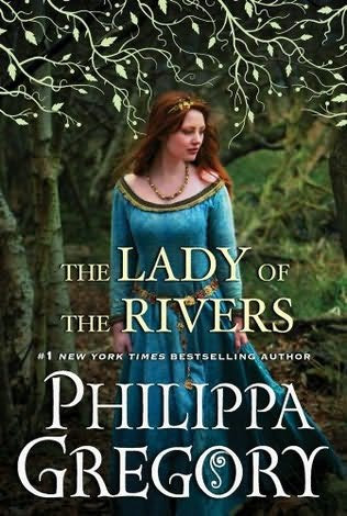
This beautiful image reminds me of Sherwood Forest and Robin Hood, as well as King Arthur and his knights. It's so perfectly medieval!
Of course, the very first thing that caught my eye was that gorgeous blue dress that I wish I could have... I also covet the beautiful, jeweled belt. The dress is simple yet elegant, and doesn't look out of place in the middle of the forest. Her necklace seems to be made of small, wooden roses, and her headband also has flowers threaded through it. This is the way I'd love to look as I await my beloved in the depths of the forest...sigh...
The woman is eompletely at ease, and obviously has something on her mind, which is why I immediately thought of a little rendezvous out in nature. Hanging above her head is a lovely pattern of stylized leaves and branches. They look silvery on the actual book, and are raised. The title and author's name are also done in raised letters. (I bought the book online as soon as I came across it, fell in love with the cover, and read the synopsis.)
Philippa Gregory
Hardcover, 497 pages
Simon & Schuster Ltd.
September 15, 2011
Genres: Historical Fiction, Fantasy,
Paranormal Romance
When I came across this cover, which is for the UK edition, I felt a little pang of disappointment... I couldn't help wishing I had found this one first, instead. In my opinion, this one is more aesthetically satisfying than the one above. The leaf pattern has become more abstract and stylized, with a definite Art Nouveau influence. I love the way it frames the young woman's face and shoulders.
The look in her eyes speaks of other worlds, old magic, and she's totally lost in it all. She is definitely "The Lady of the Rivers" on this cover! The color surrounding her is a bit blue, a bit gray, and a bit green. It's misty and dreamy, again hinting at her otherworldly origin.
The model on this jacket seems to be the same one that posed for the US cover. She's even wearing the very same dress, necklace, and headband. She's depicted in a close-up here. This gives the cover a bolder, tighter design, although I do like the bigger picture used for the US edition.
I think the lettering used for the title on the UK cover is much superior. It's totally in keeping with the medieval atmosphere, as well as showing more artistic skill, more dynamic movement. I think that the lettering used for the title of the US edition doesn't reflect the historical period at all. Besides, I think it's rather heavy-looking. It just doesn't go with the scene in the forest. It would have been better used for a cover with an ancient Roman theme. In contrast, the lettering on the UK cover is very graceful, and completely reflects this novel's historical period. Furthermore, I don't get the feeling that it's in the way. In fact, it's an integral part of the total design. Not so with the lettering on the US cover, unfortunately. I would have to say that it even detracts from the total design. I really wish it could be replaced with the same type of lettering the UK cover has!
To sum up, I do love both covers, but can't help feeling that the US one should have had better lettering. So, being the obsessed book addict that I am, I suspect I won't be able to rest until I own the UK edition, as well...
One good thing I can say about the US edition is that it has deckle-edged pages, which is something I love on a hardcover book! I don't know if the UK edition has this feature, as well.
I wonder what the rest of you think. Which of these two covers do you prefer? Or do you like them both? Perhaps, like me, you have mixed feelings about the US cover. Anyway, I'd love to find out, through your comments!
The illustration for the US cover
is really a photograph,
although I think it looks like a
painting.
The photographer
is
who is based in the UK.
You can see more examples
of his work at the above link,
as well as at this very
interesting blog dedicated totally
to book design:
The jacket design is by
The only information provided
at this link is that Ms. Li is
the Senior Art Director at
Simon & Schuster.
I tried other links, but couldn't
find anything else about her.
As for the UK cover, I don't
own that edition, so I was unable
to get the names of the
illustrator and jacket designer.
Therefore, there was no way Google
could help me locate any information
about them!
I do believe the illustration on
this cover is a painting
(perhaps watercolor?),
and not a photograph.


I love this cover! Not only for the vines at the top and around the picture but for the clothes that she is wearing and her hair! I love that time period, the clothes just make my mouth water. Great shelf candy pick this week!
ReplyDelete[:
You can check out my shelf candy here.
[:
ShawnaLeAnn
Dreaming In The Pages
Hey, Shawna! Yes, I love the vines, too -- on both covers, although I do prefer the ones on the UK cover. I love what you wrote about the clothes -- they make my mouth water, too! So beautiful!!
DeleteI'm so glad you like my picks this week. Thanks you for the wonderful comment! And I'll be visiting YOUR Shelf Candy post! : )
I can't tell which one I like better! They are both beautiful and each has their own strengths and weaknesses. I'd never heard of this book before either, so yay for new books! Thanks for sharing!
ReplyDeleteHi, Jamie! Well, I'm glad you like them both! I think the UK version is better. The US version is also beautiful, but I think the lettering spoils it. But hey, if you like them both, that's just fine! : )
DeleteI've heard of Philippa Gregory before, but have yet to read any of her books. She only writes historical fiction, and her novels are bestsellers. So I hope to get to this novel this year!
You're very welcome for the share, and thanks for your great comment!! : )
I agree, the lettering and the overlay take over too much in the US edition. I think that it is the color of the font that I am not crazy about and they used that color on the UK, *sigh.
ReplyDeleteI do still love the UK version though. I like that the girl is beautiful, yet natural and a bit flawed. All too often I see airbrushing done until it looks more like a cover girl add than a historical fiction cover. She looks a little wind blown, which would be expected for a girl who has been tromping through the forest. Hell, I look a little wind blown and I have barely left the couch this morning.
Thanks for sharing these. I always enjoy seeing more than one edition.
Have a happy weekend.
Hey, Steph!
ReplyDeleteYes, the lettering and the overlay make the US cover look too "crowded". The photograph itself is beautiful, but it's overwhelmed by the leaf pattern and the lettering. I don't mind the color of the font in either edition, though. I do think that the font on the US edition wss poorly chosen. Also, I think that the author's name is much too big. Heck, between the title and the author's name, one can hardly see the dress!
I agree that the girl in the UK cover looks very natural, instead of artificial, with that "cover girl look". She's appropriately windblown. Oh, and I love your comment about you and the couch. Lol! You're so funny!!
I think I'll continue featuring two different editions from now on -- if a book has more than one, of course.
Thank you for your very insightful comments!! : )
Hi! I totally l agree with you. While they are two beautiful covers, I think I like the intimacy of the close up on the UK cover more.
ReplyDeleteWonderful pick!
Happy Shelf Candy Day!
Hi, Kimberly!
ReplyDeleteGlad you like my pick, and also that you agree! I love the way you put it, regarding the UK cover -- "the intimacy of the close up". Very true!
Thanks for the great comment! If you have a Shelf Candy post, I'm coming over to check it out!! : )
Great pick. I love this series. I do love the closeness of the UK cover, but I think I like being able to see the full dress in the US cover...guess you can't have it all :) So, looks like I'm torn between the two. Thanks for sharing them both, I hadn't seen the UK cover before!
ReplyDeleteHi, Stephanie!
DeleteI agree with you about being able to see the entire dress. I just wish the lettering had been better integrated with the cover photograph...
You know, I just have to have that UK cover!! So, even though I already own the US edition, I'm chafing at the bit until I get the UK edition, as well!! Crazy, right? Lol. But I won't rest until I do get it!
You're very welcome for the share! Thanks for your great comment!! : )
Great choice! I like both covers, but I think that I do prefer the UK version the most, like I often do! They are both very elegant looking though. :)
ReplyDeleteStephanie @ Stepping Out of the Page
Hi, there!
DeleteYes, they're both very elegant-looking, but, like you, I think I do prefer the UK cover.
Thanks for the comment!! : )
I can see why you chose this cover. It really is gorgeous. You are right that her dress doesn't look out of place at all in the forest, she looks comfortable and a little mysterious. The colors all work together as well creating a kind of harmony.
ReplyDeleteI like the UK edition as well. This one looks a little more eery and its almost as if she is standing in front of a lake or something that fog is covering.... it just seems very watery. I like her hair as well.
Over all both covers are gorgeous but I do think I like the US version just a tad more.
thanks for the great shelf candy!
Hey, Cambria!
DeleteI think you're right about the US cover looking more mysterious. To me, that means that she's going to have a little lovers' tryst in the forest. However, there's mystery surrounding her, as well. I would love this cover wholeheartedly if it weren't for that title... I just don't like the font used for it. Also, the author's name is much too big, in my opinion. I know it's also big on the UK cover, but somehow it doesn't bother me on that one.
As I mentioned in the post, I do own the US edition, but now I'm obsessed with getting the UK edition, as well...this is going to bug me until that book is part of my collection! Lol.
You're very welcome for the shelf candy! Thanks for your terrific comment!! : )
I prefer the second cover more. The colors, the dreamy look on her face. Very pretty.
ReplyDelete