Welcome to Shelf Candy Saturday!!
This weekly feature
showcases beautiful book covers,
and provides information,
if available, on their very talented creators!
For more information
about Shelf Candy Saturday,
just click HERE.
This week, I have chosen
two very different covers for
the same book!
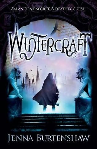
Wintercraft
(Wintercraft #1)
Jenna Burtenshaw
Trade Paperback, 278 pages
Headline Book Publishing
(Imprint of Hachette Livre UK)
May 20, 2010
Urban Fantasy, Young Adult Fiction
Why do I love this cover?
There's nothing that catches my eye faster than the color blue! So of course I was attracted to this cover. However, there are other elements in this image that are equally fascinating -- such as the fact that the gargoyles seem to be guarding a mysterious entrance, which the hooded, cloaked figure has just successfully crossed.
There's a mysterious castle in the distance, half-hidden in fog, while the magical blue mist gleams at the figure's feet. Birds -- perhaps falcons -- circle around the sky overhead, which has a background covered in strange writing. Superimposed on the dark arch, which is decorated with circles bearing unclear images, the following words appear: "An ancient secret, a deathly curse".
The font for the title is quite eerie-looking, and very effectively contributes to the overall effect of the cover.
This gorgeous cover was designed, for the UK paperback edition, by the very talented Tom Sanderson. You can see more of his work at his website, the-parish.com, as well as at designrelated.com/tomsanderson.
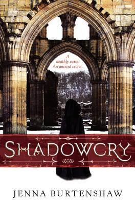
Shadowcry
(Wintercraft #1)
Jenna Burtenshaw
Hardcover, 320 pages
Greenwillow Books, Reprint Edition, US
(Imprint of HarperCollins Publishers)
June 26, 2012
Urban Fantasy, Young Adult Fiction
Why do I love this cover?
This is the cover for the US hardcover edition. When I compare two different covers, I usually prefer one over the other, but in this case, I don't. I like this one just as much as the one for the paperback edition!
This cover doesn't strike me as quite as eerie as the one above. Besides, it doesn't specifically seem to have any fantasy elements in it. Instead, it looks more like a cover for a historical fiction novel. Still, I can feel the silence, as the hooded, cloaked figure pauses before a line of arches, and looks beyond, to an uncertainly-defined landscape. Snow is falling softly, and carpets the ground in front of the abbey. This definitely adds to the appeal of this cover, since I love winter, although I've never seen snow in person.
The Gothic-style architecture is beautiful, and seems to belong to an abandoned abbey. The same words that are superimposed on the dark arch of the paperback cover, also appear on this one, but right below the second Gothic arch, with the two windows above it. Interestingly, the curse is mentioned first, and then the secret, which is the reverse order of the words on the paperback cover.
The font used for the title looks appropriately medieval, and I think it fits this cover just as well as the title "Wintercraft" fits the paperback cover.
The creator of this equally gorgeous cover is Sylvie Le Floc'h, who is a French designer working for Greenwillow Books. She published a post on their blog, titled "How I Got to Greenwillow Books:Sylvie", on July 29, 2010. Since she appears to have no website, I did some digging, and discovered an interview, for the blog That Cover Girl, which sheds some light on her creative process.
What do you think of my choices?
Leave me a comment
and let me know!


I really like it when you put of two covers of the same book and compare.
ReplyDeleteI like them both but I like the US hardcover. I actually do find it eerie in a gothic but toned down way, It looks so wintery cold and isolated. Of course the arches add to the effect.
Hey, Brian!
DeleteYeah, I LOVE to do that from time to time! And I honestly like both of these covers!
I see what you mean about the second cover being eerie in a different sort of way. Now that I look at it again, you're definitely right! And the arches do indeed add to the effect.
You know, I'm tempted to buy BOTH of these editions! I really can't decide between them....lol.
Thanks for the visit and great comment!! : )