This book meme/blog hop
is hosted by
Stephanie @
The purpose of this feature is to display
a beautiful book cover,
with information, if available,
about the cover illustrator,
photographer, and/or designer.
For all the participation rules,
just click
HERE.
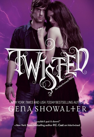
Here's my choice for this week!
(Intertwined #3)
Gena Showalter
Hardcover, 564 pages
Harlequin Teen
August 30, 2011
Genre: YA Paranormal Romance
Why do I love this cover?
I do own this book, but found no information on the cover design anywhere on it. That's strange, too, because this information is usually available on the back flap of the dust jacket. When I did a Google search, though, I did find out that the designer for the first book's cover was Art Director Erin Craig.
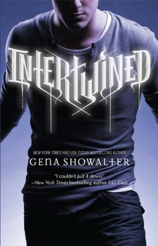
This is the first book in the series:
(Intertwined #1)
Gena Showalter
Hardcover, 440 pages
Harlequin Teen
September 1, 2009
Genre: YA Paranormal Romance
I'm guessing that Erin Craig was also the designer of the cover for Twisted. The following is from a statement he wrote, about the development of the cover for Intertwined.
For every cover we design we start the process with a meeting between Art, Editorial and Marketing. We discuss everything from the story-line details to character descriptions to comparable titles. From that point the Art Department takes over to further develop options for the cover. For Intertwined, I worked initially with three different designers in order to come up with different concepts, each having its own voice. We spent a lot of time researching what teenagers see, the magazines they read, movies and TV shows they watchm, music they download, Web sites they visit, cell phones they use -- all the types of cultural visual imagery they absorb. From there, we used our research to come up with a variety of concepts that illustrated the story.
You can view the complete document,
which includes illustrations,
HERE.
You can visit Gena Showalter's
Young Adult website
HERE.
So what do you think
of the cover of Twisted?
What beautiful cover(s)
are you featuring this week?


Twisted has a hot cover and the sky is beautiful. I have not seen these covers before. I appreciate that this designer works out thing about the story before designing. It makes all the difference.
ReplyDeleteHey, if you mix blue and pink, don't you get purple? LOL
Hey, Steph!
DeleteOh, this is DEFINITELY a HOT cover!! Everything about it is just so BEAUTIFUL!! When I first saw it, I just had to run over to Amazon and order the book!! I still have to get the first two books in this series, though.
I could have included the cover of the second book, too, but didn't want to overload the post. Besides, my favorite of all the three covers is the one for "Twisted".
I love the little joke you threw in at the end of your comment! Lol. And you know, purple happens to be my second favorite color, with hot pink in third place!!!
Thanks for your thoughts! As always, I'm thoroughly entertained!! : )
I haven't seen these covers either. I agree the pink background and the font really stand out! But I have this urge to tell the clingy girl to take a hike lol
ReplyDeleteHi, there! Oh, I absolutely love that background! And yes, that girl is a little too clingy. Glad you agree! The funny thing is, from the synopsis, it'very clear that she saved HIM, and not the other way around! But who knows, maybe she got clingy somewhere along the line...
DeleteThanks for commenting!! : )
Great covers! I love the title font and the "V" design of it! I like when a series of covers fit well together. Nice picks!
ReplyDeleteHi, Steph! I agree -- it's really neat when covers in a series fit well together! Thank you so much for the comment!! : )
Delete