Welcome to Shelf Candy Saturday!
This is my weekly feature
showcasing beautiful covers!
It also provides information,
if available, on their
very talented creators!
if available, on their
very talented creators!
My Thoughts About This Cover
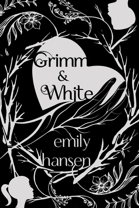
This is a totally stunning cover! The stark contrast between the two tones makes a very strong visual statement. Actually, the 'white' areas are really a very light gray. This works beautifully, because a real white would be too much of a sharp contrast, I think. For some reason, the light gray gives this cover a more elegant feel, too.
The design is nothing short of brilliant! The hand holding the heart is symbolic of an unbalanced relationship, which is what the plot is all about. Someone in this relationship has emotional power over the other person. The hand is laced with branches, which, at the same time, represent veins. This motif of branches is repeated all over the cover. It also seems as if these branches have thorns.
There are pretty little flowers and budding leaves at the top and bottom of the cover. These probably symbolize the beautiful moments in this relationship. But the heart in the hand dominates the cover.
There's a small female head in the lower left-hand corner of the cover, and a corresponding small male head in the upper right-hand corner. These represent the protagonists of the novel, and the heart in the hand is the conflict between the two of them.
I also get a fairy tale 'vibe' from this cover. It's as if all the branches represent obstacles that must be overcome, like perhaps a threatening forest surrounding a castle. This is very appropriate to the book, which is a fairy tale retelling.
The highly-talented artist responsible for this magnificent cover is Murphy Rae, a freelance graphic designer and editor, whose services include beta reading. I have been unable to get any more information than this. She creates awesome covers, as is evident from her portfolio, as well as her Twitter and Facebook pages.
week's cover?
Please leave a comment
and let me know!


As always this is a super analysis of this cover Maria.
ReplyDeleteI agree that this is a great cover for the reasons that you mention.
It is so interesting how so much can be done with just back and white, or off white. Sometimes the human imagination can do so much with the simple and the minimal. I think that this is one of the reasons why art is so diverse and wonderful.
Hey, Brian!
DeleteThanks for the good word!! :)
One of the tour companies I do blog tours for, Bewitching Book Tours, recently sent me an email about this book. They regularly send out emails about books to go on tour, and, of course, bloggers sign up for the books that interest them. When I saw this cover, BOOM!! So I signed up right away!! Then I decided to feature it on Shelf Candy Saturday.
I will be reviewing this book in June. And you know what? The author must have seen my blog post yesterday, because she sent me a free copy of the book, through Amazon!! So that really made my day!!
You are SO right that a lot can be done with just black and white, or even off white! We humans are very imaginative, and very creative! And yes, that's why we have SO many WONDERFUL, BEAUTIFUL artistic creations!
Thanks for the GREAT comment!! Hope you and your wife are having a TERRIFIC Sunday!! :)