Welcome to
Shelf Candy Saturday!!
This weekly meme/hop,
hosted here,
features beautiful book covers!
If you'd like to participate, just grab my button (or create your own). write your own post, and link up in the Linky widget at the bottom of this post. (Just click on "Read more" so that the entire post will open up.)
As a bonus, you can include information on the artist, designer, and/or photographer, but it's not required. You can simply feature a cover and explain why you love it!
Here's my choice for this week!
Hardcover, 432 pages
Bloomsbury, USA
June 18th, 2013
Historical Fiction, Romance
Why do I love this cover?
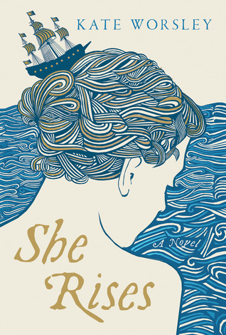
Truly inspired covers immediately catch my eye, and this one is certainly inspired! It's simply stunning. Those beautiful swirling blue ribbons in the sea, as well as the girl's hair! They have such a beautiful, repetitive rhythm, as they move over the cover, in and out, mimicking the ebb and flow of the sea...
The basic composition is really pretty simple. The girl's three-quarter profile is drawn with an utmost economy of line. However, this image is breathtakingly beautiful because of the brilliant design concept of those swirling ribbons!
It's wonderful that a muted color scheme has been chosen. This makes the image bolder, emphasizing its linearity.
I also love the detail of the small ship sitting on top of her head, like a hair clip. At the same time, a visual metaphor is created, since the ship is 'navigating' the rolling 'waves' of the girl's hair.
The font used for the title and author's name is just perfect, since it's typical of the time period, and doesn't distract the viewer from this gorgeous image.
One last detail -- the words 'A Novel' are tucked in between the folds/waves of the sea, close to the girl's chin. Very clever little touch, I think!
I wish I could have gotten some information on the brilliant designer of this cover, but this book hasn't even been released yet, so I don't own it. I've searched online, too, but I have been unable to get any information on this artist. Sometimes authors will credit the cover artist for their book on their website or blog. This author doesn't have either one. The style, though, does remind me of a very popular 1970's designer -- Peter Max. I wonder if this cover could have possibly been designed by him, although he tends to use very bright color schemes.
Purchase Links
What do you think of my choice?
What beautiful cover(s)
are you featuring this week?


I love beautiful book covers and was glad to find your meme. I've written about it on my blog and linked above. Thanks!
ReplyDeleteHi, Jan!
ReplyDeleteWelcome to Shelf Candy Saturday! I'm happy you found this meme, and that you love this cover!
I'll be checking out your post. Thanks for participating!! :)