This wonderful book meme/blog hop
is hosted by
Stephanie @
The purpose of this feature is to display
a beautiful book cover,
with information, if available,
about the cover illustrator,
photographer, and/or designer.
For all the participation rules,
just click
HERE.
Here's my choice for this week!
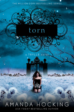
(Trylle Trilogy, #2)
Paperback, 324 pages
St. Martin's Press
February 28, 2012
(first published November, 2010
Genres: Fantasy, Young Adult,
Paranormal Romance
Why do I love this cover?
What an absolutely gorgeous dream landscape this is! The mystical, blue night sky is the perfect backdrop for the Gothic-looking gate which opens onto a sea of what appear to be dandelions. According to the book's back cover, they're actually thistles. Such eerie-looking plants they are, too! They surround the girl with their glowing, milky whiteness...and they're prickly, too...
The highly talented designer
of this cover is
whom I featured in
the Switched post.
She's a graphic designer at
St. Martin's Press.
In order to design her covers,
she brings together images
from various sources.
You can view her portfolio of covers
HERE.
These are the images used
on this cover:
Girl - Herman Estevez
Gate - Michael Runkel/Getty Images
Winter landscape - Cattallina/Shutterstock
Frozen thistle - Tamara Kulikova/Shutterstock
Swirl logo - Shutterstock
Where to buy this edition:
So what do you think
of this cover?
What beautiful cover(s)
are you featuring this week?



This is my first time seeing this cover and I love it!! All of Amanda Hocking's books have gorgeous covers and this one does not disappoint!!!
ReplyDeleteHi, Jen!
ReplyDeleteYes, it's gorgeous, isn't it? I love the work of this designer!! I just wish I had been able to find some biographical information on her.
Thanks for the great comment!! : )
I wouldn't have to see this cover on your blog to have it remind me of you. The blue is beautiful with the cold setting. It looks so creepy and mysterious. The use of the scroll work is a nice touch too. Thank you for sharing it and for including the artist's info. She did a beautiful ob on Switched as well.
ReplyDeleteI love the Trylle Trilogy covers. They were the main reason why I added the books to my TR list.
ReplyDeleteBeautiful choice! I have heard mixed reviews of this series, but one thing is certain: Everyone I know is talking about these covers! I love this color blue. It really sets a tone! Great pick.
ReplyDeleteI'm a little late this week but if you're interested, my shelf candy is here: http://www.thewindypages.com/2012/07/shelf-candy-saturday-36.html
Happy Sunday!!
Hi, Steph!
ReplyDeleteI don't know what it is about the color blue that gives me the warm fuzzies! Lol. There's just something about this color...
This cover is truly inspired! It's remarkable how the designer has pulled together all the different elements to create such a stunning picture!
The scrollwork is absolutely AWESOME. I wish I knew who did it, since it came from a stock image service.
You're very welcome for the share, and thanks for another lovely comment!! : )
Hi, Lis!
ReplyDeleteI've heard that this trilogy is terrific! Well, Amanda Hocking already has an amazing reputation, doesn't she?
Thanks for commenting!! : )
Hi, Kimberly!
ReplyDeleteYou know, when I first saw "Switched" on Goodreads, I checked out several editions. I did the same thing with "Torn" and "Ascend", the following books in the series. So I immediately bought this particular edition! Pompilio is truly an amazing designer!! I like to own books with beautiful covers, and I'm even willing to pay a little more in order to own an edition with a beautiful cover!
Thanks so much for the comment, and I'll be checking out your Shelf Candy post!! : )