Welcome to
Shelf Candy Saturday!!
This weekly meme/blog hop, hosted here,
features beautiful book covers!
If you'd like to participate, just grab my button (or create your own), write your own post, and link up in the Linky widget at the bottom of this post. (You have to click on "Read more" so that the entire post will open up.)
As a bonus, you can include information on the artist, designer, and/or photographer, but it's not required. You can simply feature a cover and explain why you love it!
Here's my choice for this week!
(The Name of the Blade #1)
Trade Paperback, 368 pages
Walker Books
July 4, 2013
Fantasy, Mythology, Paranormal Romance,
Young Adult Fiction
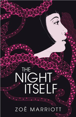
Why do I love this cover?
This is truly inspired design! The bold simplicity of it is part of its beauty. Those bright, hot-pink necklaces entwined all over the cover space are not only gorgeous, but serve to help the eye move all over the image, bringing it to the girl's head, then moving all over again, thus bringing dynamism to the whole space.
The girl's face has been drawn realistically, but still echoes the stylized drawings done by such Japanese masters as Hokusai. Her nicely-shaped haircut gives her face a modern look, and yet, reminds me of the hair styles popular in the 1920's. Perhaps that's because this particular cover has an Art Deco influence, too. (Scroll down the page when you get to this site.)
As I continue to gaze at this cover, I suddenly realize that the 'necklaces' could also be strings of Japanese or Chinese paper lanterns, such as those used in the traditional festivals of China and Japan.
The font used for the title and author's name is also simple and bold, and has an Art Deco influence, as well, which I find delightful, since I love that artistic style!
I've been able to find out the name of the fabulously talented creator of this gorgeous cover, Andrew Archer, thanks to the author's blog, where she first revealed the image, on January 17th. Included in that post, which you can access HERE, is a picture of the entire cover, front and back, which I am not putting up here for copyright reasons. You can also see a photo of the book's title page, plus some giveaway swag, HERE. The title page carries the necklace designs onto it, which is a very nice touch indeed!
Andrew Archer Artist Bio
(from his blog)
I'm Andrew, and twenty-six years ago, I was born
in Auckland, New Zealand, and this is where
I still call home.
I've been working as an illustrator
since 2006. Before that I studied graphic design
and worked in the industry for a few years
only to realize 80 percent of my 'design'
was actually illustration.
I use a healthy mix of both traditional and
digital techniques with no real preference of medium.
Partial Client List:
WIRED, Runner's World, ESPN, The Economist,
MOJO, Q Magazine, Random House,
Penguin Books, Ell, NZ Herald
Online Links
(the 2/10/13 post has more images
of this great cover)
What do you think of my choice?
What beautiful cover(s)
are you featuring this week?


Hi, sorry a bit late getting this up but better late than never. Had fun posting a cover I love not because it is good but because it is just so truly bad.
ReplyDeleteLove the effective and beautiful cover you posted.
Another great choice Maria!
ReplyDeleteI see the Art Deco influence very clearly. I would never have noticed the lanterns if you had not mentioned them.
Love the art deco cover! I don't think I will ever get tired of that look.
ReplyDeleteHi, Arabella!
ReplyDeleteHey, you don't have to apologize for putting up the post 'late'. I see that you commented here at 9:00AM. That sounds pretty early to me, on a Saturday morning! Lol. Really, anytime you post on Saturday is fine.
I'm glad you like this cover, and I can't wait to see the bad one you posted! That's a nice, little twist on this meme!
Thanks for participating in "Shelf Candy Saturday"! :)
Hey, Brian!
ReplyDeleteThis cover just takes my breath away....glad you like it, too!
Yes, the Art Deco influence is very obvious, and makes this image so very beautiful.
As for the lanterns, it took me a while to see them, too. Then suddenly, I had an "Eureka!" moment.
Thanks for the nice comment!! :)
Hi, Shannon! (River City Reader)
ReplyDeleteYes, Art Deco is a very beautiful style of graphic design. I love it as well!
Thanks for participating in "Shelf Candy Saturday"! :)