Welcome to Shelf Candy Saturday!
This is my weekly feature
showcasing beautiful covers!
It also provides information,
if available, on their
very talented creators!
if available, on their
very talented creators!
Katherine Tegen Books
October 13, 2015
(first published November 29, 2013)
Fantasy, Historical Fiction, Mystery,
Romance, Young Adult Fiction
October 13, 2015
(first published November 29, 2013)
Fantasy, Historical Fiction, Mystery,
Romance, Young Adult Fiction
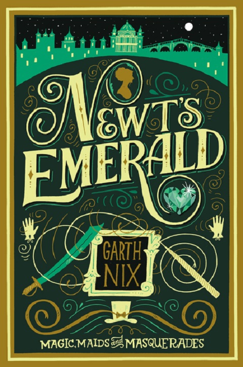
Interestingly, featuring covers whose main design is typography itself has now made me more aware of such covers. I had never found them fascinating before, but now I feel differently. Such covers can indeed be beautiful, and this one is a stunning example.
The cover I've picked for today has a 19th-century feel to it, but looks modern at the same time. I love the font used for the title, as well as all the little curlicues that embellish it. I also love that the letter "N" encloses a cameo in it, while the letter "R" encloses a gleaming emerald heart-shaped jewel.
The city walls at the top of the cover are mostly a simple silhouette, yet they contain enough detail to give the cover an exotic feel. Indeed, they remind me of the Arabian Nights.
I love how several of the cover elements are balanced, one on each side -- the two white gloves, as well as the scimitar on the left, and what could be a unicorn horn (or perhaps a magic wand) on the right.
The author's name is very nicely framed, with a very nice contrast between the simple font used for his name, and the ornateness of the frame itself.
The curlicues are actually all over the whole cover, which brings back memories of doodling in my notebook during boring math classes....lol. At the bottom of the cover, there's also a top hat. Springing from it are two large curlicues that strongly remind me of a handlebar mustache. This is a very nice touch!
In short, this cover has a very whimsical, cute feel to it, with hints of faraway lands and 19th-century traveling carnivals. The title itself reminds me of the signs used back then, not only for carnivals, but at the front of business establishments, as well.
The artist responsible for this brilliant cover design is Mary Kate McDevitt, a graphi designer (she refers to herself as "a letterer") and illustrator based in Philadelphia. She has a degree in Graphic Design and Illustration from Tyler School of Art in Philadelphia., which she obtained in 2007. Some of her clients include Chronicle Books, Target, Sesame Street, Hallmark, Penguin Books, and AT&T.
My list of favorfite book cover artists is certainly growing!! Now it includes artist who use typography as their main design!
Online Links
Mary Kate McDevitt
week's cover?
Please leave a comment
and let me know!


