Welcome to
Shelf Candy Saturday!!
This weekly meme/blog hop, hosted here,
features beautiful book covers!
If you'd like to participate, just grab my button (or create your own), write your own post, and link up in the Linky widget at the bottom of this post. (You have to click on "Read more" so that the entire post will open up.)
As a bonus, you can include information on the artist, designer, and/or photographer, but it's not required. You can simply feature a cover and explain why you love it!
Here's my choice for this week!
(In Search of Lost Time, #1)
(translator: Lydia Davis)
Hardcover, 496 pages
Viking Adult
September 15, 2003
(first published 1913)
Classics, Literary Fiction
Why do I love this cover?
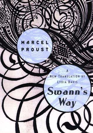
This is such an obviously gorgeous cover! Those swirling lines sweeping across most of the space, then tightening into a jewel-like, intricate design at the top of the cover, give the image a lot of dynamism. These elegant lines are obviously derived from calligraphy. Instead of spelling out words, however, they themselves become the design. Their graceful dance captivates the viewer's eye; there are spirals twisting upon themselves at the top of the cover, forming beautiful circles that remind me of spiral staircases.
The flowing line design is 'interrupted' by the two pale blue circles that enclose the author's name, as well as the title of this novel. For some reason, this unusual combination does work, and the whole composition alternates between dynamism and the state of rest. This is an apt metaphor for the whole theme of this novel. Time, after all, is dynamic, ever-flowing, but it can also appear to be static, especially when one is waiting and waiting at the doctor's office, for instance.
I love the contrast of the space enclosed by the tightly-knit pattern, and the more open space toward the bottom. Whoever designed this cover, they certainly know good design principles! If the intricate pattern had been repeated all over the cover, it would not have been such a stunning one, and people wouldn't be drawn to it. Conversely, if the image had only consisted of open flowing lines, the cover would have been too monotonous, and thus, boring.
Another aspect of this design that I love is the strong Art Nouveau influence. I love that artistic style! Since it originated in France, and Proust was French, that makes this image even more appropriate for this novel. In fact, I think it's truly inspired work!
Since I don't own this beautiful book (yet!), I have no idea who the artist/designer is, unfortunately. When I decide to buy this edition (which, knowing the way I am, will be as soon as possible!) I will refuse to consider any other. My addiction to beautiful books means that this is the only edition I want to have in my possession! (It's hard to find at a reasonable price, though...)
Purchase Link
What do you think of my choice?
What beautiful cover(s)
are you featuring this week?


What a wonderfully elegant cover, I love the way it evokes a more elegant age and it is perfect for that novel. It makes me want to read it and that is a novel I am a bit wary of, so it is a very effective cover.
ReplyDeleteSo glad I found this great meme! I'll definitely be participating weekly!
ReplyDeleteLove the intricate designs!
ReplyDeleteHi New addition to the hop and follower of your blog! Would love if you can hop by and follow back!
ReplyDeletehttp://bookkraze.com
ReplyDeleteHi, Arabella!
ReplyDeleteYou know, I've had this book on my TBR shelf at Goodreads for the longest time...I was searching my shelves for a cover to feature this week, and saw this one. Yes, it is indeed a very elegant cover!
Like you, I find this novel a challenge, but the cover makes me want to read it!
Glad you like my choice! Thanks for the comment and for participating in this meme/hop!! : )
River City Reader:
ReplyDeleteHi! I'm so glad you found this meme, too! Welcome!! Thanks for the comment, and for participating! Looking forward to your posts!! :)
Jen (LRAtRandom):
ReplyDeleteHi! The intricate design is indeed beautiful! Thanks for commenting and participating!! :)
Hi, Coco!
ReplyDeleteOh, it's great that you're joining us! Welcome!!
Thank you so much for following my blog, and participating in this meme/hop! I'm looking forward to your posts, and will definitely follow you back!! :)
This is indeed another great choice! It is also a bit subtle which is appropriate for the subject.
ReplyDeleteThe little bit of blue over the black and white also works very well.
Hey, Brian!
ReplyDeleteGlad you like this one! I agree -- the little of blue works very well indeed!
And now I'm looking high and low to get this book!
Thanks for the nice comment!! :)