Welcome to Shelf Candy Saturday!
***Late Edition***
This is my weekly feature
showcasing beautiful covers!
It also provides information,
if available, on their
very talented creators!
if available, on their
very talented creators!
Here's my choice for this week!
The Gilded Cage
Lucinda Gray
Trade Paperback, 256 pages
Henry Holt & Co. (BVR)
August 2, 2016
Historical Fiction, Mystery, Romance,
Young Adult Fiction
Lucinda Gray
Trade Paperback, 256 pages
Henry Holt & Co. (BVR)
August 2, 2016
Historical Fiction, Mystery, Romance,
Young Adult Fiction
My Thoughts About This Cover
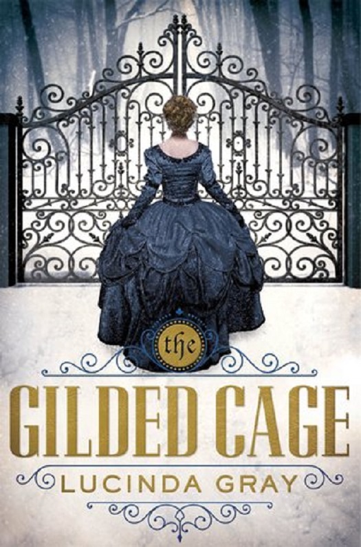
This cover has such an IMMEDIATE visual appeal! The overall shapes and design are bold, yet there are also delicate touches in the image.
I love that the ornate, intricately beautiful ironwork on the gate is echoed in the ornamental designs around the GORGEOUS title! The classic font is just perfect for this particular cover, too! Furthermore, the gold color of the letters alludes to the "gilded" part of the title.
In regards to the title, I also love that the word "The" has been placed in a golden circle on the hem of the dress. Very nice touch!
The whole centerpiece of the cover is that oh-so-beautiful dress, with its equally intricate, lacy, overall designs, as well as its layer upon layer of just total beauty.
Normally I would say that the color of the dress is too dark to be beautiful, but somehow, it's just perfect for this scene, which takes place in the winter. The color of the dress echoes the color of the wrought-iron gate, as well as the misty landscape beyond. The gate even resembles part of a cage, which is very fitting for the title of the book. In fact, it also gives me the feeling that the young woman feels trapped as she stares at the apparently formidable barrier before her.
Another appealing thing about this STUNNING cover is the feeling of trepidation and mystery evoked by the whole image. The young woman is obviously feeling fearful and hesitant as she faces that ominous-looking gate. What lies beyond it? She doesn't know, and neither do we, the viewers, who are therefore being invited to open the book and find out!
This cover awesomeness was created by the BRILLIANT April Ward, who has designed covers for such publishers as HarperCollins, Harcourt Trade Publishers, North South Books, and Flashkids Books. Born in the Pacific Northwest, she graduated with a BFA (Bachelor's of Fine Arts) from the prestigious Pratt Institute in Brooklyn, NYC.
She is currently the Art Director of Square Fish Books at Macmillan Children's Publishing Group. She designs YA, Middle-Grade, Nonfiction, and Picture Books. One of her best-known covers is for the novel Ruby Red, which I will be featuring here at "Shelf Candy Saturday" very soon!
And here's another GREAT cover artist to add to my ever-growing list of favorite cover designers/illustrators!
Online Links


I love this cover. I agree with your commentary on it. In addition, I think that the image of the forest is so well done. It really has the look and feel of a forest during snowfall. These are scenes that I really enjoy looking at in real life.
ReplyDeleteThere is also symmetry to the woman, the dress and the gate that works vey well. The blue , white and gold also work very well together.
Have a great Sunday Maria!
Hi, Brian!
DeleteI'm glad yo love this cover, too! :)
Yes, the image of he forest is very well done. It conveys a sense of mystery and foreboding. And you are SO lucky to have been able to see -- in person -- what a forest looks like after a snowfall.... Right now I'm reading a novel that takes place in Vermont, in a forested area, and am feeling SO wistful..... lol. Forests and snow! Just the combination I ADORE!! :) :)
Yes, the symmetry on this cover is just PERFECT. Everything on it works together SO beautifully!!
Thanks for another interesting comment!! Hope you have a wonderful week!! <3 :)
An absolutely lovely cover and I have this one on my TBR too. I like the repetition of the shape in the gate and the title, and I always love of well dressed woman of that era.
ReplyDeleteHi, Sam!
DeleteYes, isn't it? And I now have this one on my TBR, as well! It sure looks like it will be a GREAT story!
I like that repetition, too! It's SO effective in tying the whole design together. And, like you, I love the dresses of that era! Sure wish I could attend a grand ball wearing one of them! :)
Thanks for the nice comment!! Enjoy your week!! <3 :)
This really is an eye-catching cover. I like it too, Maria. I agree that the dress might be too dark under different circumstances, but with the snowy background, it contrasts very nicely. This is definitely a book I would pick up for a closer look just based on the cover. :-)
ReplyDelete