Welcome to Shelf Candy Saturday!
*Late Edition*
This is my weekly feature
showcasing beautiful covers!
It also provides information,
if available, on their
very talented creators!
if available, on their
very talented creators!
Here's my choice for this week!
Gyre
(The Atlas Link Series, Book 1)
Jessica Gunn
Trade Paperback, 312 pages
Curiosity Quills Press
February 1, 2016
Fantasy, New Adult, Romance,
Science Fiction, Young Adult Fiction
(The Atlas Link Series, Book 1)
Jessica Gunn
Trade Paperback, 312 pages
Curiosity Quills Press
February 1, 2016
Fantasy, New Adult, Romance,
Science Fiction, Young Adult Fiction
In this week's post, I'm contrasting two different covers for the same book.
This is the case of a cover that was changed, presumably by the publisher, and said change has not entirely been for the better. I MUCH prefer the first cover chosen. It really bothers me that publishers do this kind of thing!! Maybe, in this case, it was the author who initiated the change. I really have no idea.
This first cover has a very simple, yet very effective design. And the color used all over the image happens to be my very favorite, too!! This beautiful design is just highly symbolic to me. It makes me think of distant galaxies, constellations, space travel....as well as the famous model of the interlinked DNA strands. It even makes me think of different dimensions or universes. And, of course, there's that GLORIOUS blue!!
I also LOVE the font used for the title! Although it's basically a classic one, it's been enhanced in a very elegant way. Its design has even been brought down to the author's name, which is located at the bottom.
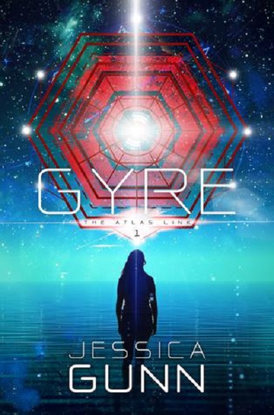
Below is the new cover chosen for this novel. I can find no trace of the one above. I thought it might have been the cover for the British edition, but I checked out The Book Depository, and they have the same cover shown below, which is also on Amazon.
Although this second cover is not really TERRIBLE, I don't find it as interesting as the first one. First of all, it's more of a typical SF cover. Although the composition is nice, and I like the large, orange-toned image that looks like a stargate, I just think this cover does not have the originality of the first one above. Well, at least the cover artist did incorporate some blue in it; in this case, it's more of an aqua tone.
I will admit that there's a sense of heightened mystery about this second cover. Maybe this is what the author, and/or the publisher was/were after. The viewer does start to wonder what that glowing object up in the sky is, and how it's connected to the young woman silhouetted below it. The expanse of aqua, which has two distinct tones, suggests ocean and sky -- the sky below the stratosphere. Above that, there's the deeper blue of the universe beyond. Oh, I'm getting a Star Trek vibe here!! And I do like the Art Deco font. Hmmm.... I think this second cover is starting to grow on me.... However, the first one remains my favorite!!
I have been unable to discover the identity of the first cover artist. It might be the same person who created the second cover, but I really don't think so, as the styles are not similar. Then again, I might be mistaken about this.
The creator of the second cover is Eugene Teplitsky. He's the Managing Partner and CTO at Curiosity Quills Press. He has a wide range of experience, from web application development to graphic design, with a specialization in the publishing industry. He's a graduate of City University of New York City College, and lives in the Washington, DC, area, with his three kids.
Online Links


Hey Maria.
ReplyDeleteI really like the idea comparing two covers like this.
I also like the first cover better but they both have their charms.
It is interesting that before I read tour comment about Star Trek and the second cover, I was thinking that the first cover reminded me of some of the special effects from Star Trek The Next Generation. This may be the effect of having too much Star Trek on the brain :) More likely it shows just how influential Star Trek has been.
The font used on the second cover does remind me of some of the fonts used in the titles of the Star Trek films.
Have a great Sunday!
Hey, Brian!
DeleteThanks for the good word!! <3 :)
Sometimes I do come across alternate covers for the same book, when I'm checking out Goodreads. So yeah, I thought it would be good to compare and contrast these two.
I guess that, like you, I've had "Star Trek on the brain" these past few days, lol. Have you noticed that, since posting my review of "The Rings of Tautee", most of the subsequent posts have been about SF books? So Star Trek must have had something to do with that! Lol.
Anyway, it's really interesting that the first cover here reminds you of some special effects from NextGen. WOW!! Talk about coincidences! I'm not all that familiar with this version of the Star Trek universe, as you know. I guess I should really try to catch some of these episodes sometime. Not too keen on the idea, though....
As for the font on the second cover, it looks somewhat familiar to me, as well, so I must have seen it in the title of some of these ST films.
BTW, I have not seen the movie in which Captain Kirk dies. In fact, I was VERY UPSET that such a film would be made!! I'm also mad at William Shatner for participating in it!! Of course, everyone dies in real life. But heck, our fantasy heroes should remain IMMORTAL. And the five-year mission of the USS Enterprise should go on FOEREVER. Lol.
There! That's my little rant for the day!! Lol.
Thanks for ALWAYS leaving such nice, as well as interesting comments, on these book cover posts!! LIVE LONG AND PROSPER!!! <3 <3 :) :)
There is something harder about the second one. More defined lines, maybe structured is a better word? Either way, I think the first is better. There's more to spark the imagination.
ReplyDeleteHi, Verushka!
DeleteYeah, I agree!! I can't quite put my finger on it, but I see what you mean. I think you put it very well! Glad yo prefer the first cover, too! You're absolutely right when you say that: "There's more to spark the imagination". SO true!
Thanks for the nice comment!! Hope you're having a nice Monday!! <3 <3 :) :)
I love the first one! It's so chilling and eerie, and I totally agree with your analysis :) I thought the second one's colours didn't go so well together, as well? It was......uglier, I suppose.
ReplyDeleteGreat post, Maria! <3 :) :)
Hi, Amy!
DeleteYeah, the firsr cover is really the BEST of these two, I think. Glad you agree! And you're right -- it IS chilling and eerie, but still SO beautiful! And I'm glad you agree with my analysis of it!!
Good point about the colors of the second cover not going so well together. True indeed!!
Thanks so much for the compliment, and for the comment!! Hope you're having a GREAT day!! <3 <3 :) :)