Welcome to Shelf Candy Saturday!
This is my weekly feature
showcasing beautiful covers!
It also provides information,
if available, on their
very talented creators!
if available, on their
very talented creators!
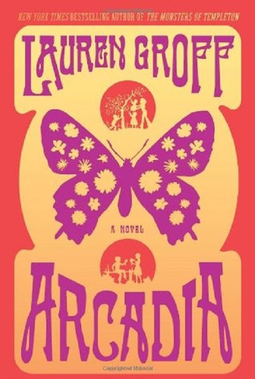
The color orange has never been one of my favorites, nor has any variation thereof. Yet I love it on this cover! I also like the peach pastel shade! In fact, I think this is a totally STUNNING cover!! It's just PERFECT for this book's subject matter too, as it chronicles the founding of a hippie commune called "Arcadia", by a group of idealists in the late 1960s.
The designer actually presented an alternate color scheme for this cover, which uses the colors light green, light peach, and a sort of grayish brown. I would have preferred those colors, but I also like the orange and peach that were finally chosen.
You can view the alternate color scheme by clicking on the link, "Creation of the Arcadia Cover", which you will find below.
That period in American history is such a fascinating one! There are things I like about it, such as the freedom of expression, the idealism, the creative explosion, especially in music. Conversely, there are things I don't like about it, such as the drugs and 'free sex'. Still, it remains a very compelling historical period.
The butterfly, which is the central image, is, of course, symbolic of several things, such as beauty, freedom, creativity, the fulfillment of a long-held dream.... It also references the idea of 'flower power' with the inclusion of sylized flowers on its wings.
The overall design is so typical of the time period, too. It's bold, funky, and reminds me of the work of Peter Max, who became famous for his posters and other graphic images. I LOVE his work, too! There's a very obvious psychedelic influence in Max's work, as well as in this cover design. Paradoxically, I LOVE psychedelic art, even though I deplore the use of drugs.
You can see Max's art HERE. Be sure to scroll down to see more images.
Another nice touch is the inclusion of the little silhouette vignettes, one above and the other beneath the butterfly. They refer to the novel's main character, a boy named Bit, who is the story's narrator.
The font is just lovely, and has a definite Art Nouveau influence, This style became popular again in the late 60s and early 70s, and I think it goes so well with this cover design!
This is actually a very simple, bold design that makes a great visual statement, and I wish it had been published as a poster, as well, because it would certainly look GREAT on a wall!
The brilliant designer of this fabulous cover is Will Staehle, who is based in Seattle, Washington, and runs Unusual Corporation, where he creates covers, posters, and also does web design. A graduate of Minneapolis College of Art and Design, he was at one time Art Director for HarperCollins in NYC. He was also the VP of Design at JibJab in Los Angeles. He has been named by Print Magazine as one of the Top Twenty Under Thirty New Visual Artists.
I have just discovered that Staehle also designed another favorite cover of mine -- the one for Armada, by Ernest Cline! No wonder I liked the Arcadia cover! (Interesting....both of these titles start with the letter "A"...) This guy SERIOUSLY rocks!!
Online Links
Website
Talking Covers:
Creation of the Arcadia Cover
Book Riot: Interview
LinkedIn
Twitter
Website
Talking Covers:
Creation of the Arcadia Cover
Book Riot: Interview


Hey Maria,
ReplyDeleteI really like this cover too.
Your comment about not liking colors has gotten me thinking. Though I also say that I do not care for certain colors, when I think about it, I think that any collar used in the right e=way, can lead to a pleasant picture. This cover is a good example of that.
I like the cover for Armada also. As someone who grew up in the video game culture of the 1980s, it seems perfect for the theme of this book. By the way, I really want to read it.
Hey, Brian!
DeleteYou know, you've made a great point about any color(s) working on a cover if used in the right way. So I do think that, although orange and peach are by no means my favorite colors, they do work very well with this design. Still, I would have preferred some tones of blue and/or aqua....lol. You know how much I LOVE blue! Lol. But I still like this cover.
I own the "Armada" book, and have been wanting to read it for a while now, even though I'm not a gamer myself. But it does look good!! And what the heck, I LOVE that cover!! So I do want to read it!
Thanks for the nice comment!! :)
You're so right! That's a beautiful cover! :)
ReplyDeleteHi, Irena! Yes, it is! Thanks for stopping by! :)
Delete