Welcome to Shelf Candy Saturday!!
This is my weekly feature
showcasing beautiful book covers!
It also provides information,
if available, on their very talented creators!
For more information
about Shelf Candy Saturday,
just click HERE.
Here's my choice for this week!
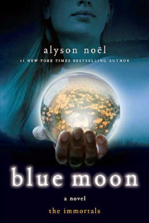
Blue Moon
Paperback, 284 pages
St. Martin's Griffin
July 7, 2009
Paranormal Romance, Urban Fantasy,
Young Adult Fiction
Why do I love this cover?
Once again I am irresistibly drawn to a blue cover....and a very beautiful one, too!
I can honestly say that I've never seen anything like this before. The girl on the cover is not emphasized; instead, it's the glowing crystal globe in her right hand that takes center stage. The effect is very dramatic, to say the least! I'm not sure exactly what is trapped within this globe, either. Could it be a green prairie full of flowers? An entire world? Whatever it is, it's full of light, and this light illuminates the darkness that surrounds the girl. This luminous globe becomes the moon, in a metaphorical way.
There's a whole air of mystery about this cover that is totally fascinating to me. Why is the girl holding out this globe to the viewer? What message is she trying to convey to us?
The title is done completely in lower-case letters, which is a nice touch, as it subtly points out that this is a young adult novel. The letters glow, too; which is also very effective
I happen to own this book, so I found the cover designer's name on the back cover. However, this information wasn't very helpful. After an extensive Google search, I have been unable to locate any data on the very talented cover designer, whose name I have listed below, along with the links for the separate elements she brought together for this great cover. (I could not find a link for the girl's picture, though....)
I happen to own this book, so I found the cover designer's name on the back cover. However, this information wasn't very helpful. After an extensive Google search, I have been unable to locate any data on the very talented cover designer, whose name I have listed below, along with the links for the separate elements she brought together for this great cover. (I could not find a link for the girl's picture, though....)
Cover design by Angela Goddard
Cover art: crystal ball @ Image Source/Corbis;
girl @ plainpicture/Fancy;
What do you think of my choice
this week?
Please leave me a comment
and let me know!
Thanks!!


I like this one.
ReplyDeleteThe contrast between what is in the ball and the rest of the cover is striking.
I usually find blue to be an uplifting color. Here however I get the impression of somberness.
Hey, Brian!
DeleteYeah, the contrast is very dramatic! This is a very powerful image.
You're absolutely right about the somberness of this cover. Interesting how the same color can have different "moods"!
Thanks for the great comment!! : )