Welcome to Shelf Candy Saturday!!
This is my weekly feature
showcasing beautiful book covers!
It also provides information,
if available, on their very talented creators!
For more information
about Shelf Candy Saturday,
just click HERE.
Here's my choice for this week!
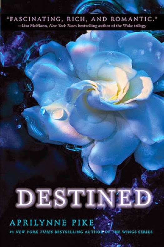
Destined
(Wings, #4)
Hardcover, 307 pages
May 1, 2012
Harper Teen
Fantasy, Paranormal Romance,
Young Adult Fiction
Why do I love this cover?
This cover is simply visual ecstasy for me! Please excuse the exaggeration.....but the image is just so utterly beautiful! The flower is very delicately and exquisitely detailed, and is done in aqua, which is very close to blue....ahh, bliss! Also, the specific tone used here looks very otherworldly, because it's iridescent. The soft, pearly aqua glides in and out of shadowed folds so gently that the flower paradoxically looks very realistic, as well. Also, it's wonderful that some of the petals have areas of white. Along with the shadows, this ensures that the overall color won't be monotonous. I love the slight hint of a rainbow, too, on one of the upper petals.
Some of the petals have drops of water glistening on them; these are also very realistic. The background looks very mysterious. At first, I thought that the circles were ripples in water. Upon closer inspection, I saw that they are designs of some sort. They definitely add to the otherworldly effect of this ethereal-looking, yet very realistic flower!
I also love the way the slightly spiraling movement of the petals in the middle of the flower lend some dynamism to the composition. They also seem to be inviting the viewer to enter the fantasy world of the novel.
Yet another element contributing to this cover's beauty is the fact that the flower is placed slightly off center. This leaves a very nice, negative shape around the flower, which serves to emphasize it even more.
Now, as for the creator of this luscious cover, his name is Mark Tucker. Yes, it's listed on the back cover of the book, which I saw in the Amazon reader. I did find his blog, a page from which you can access HERE. It shows another exquisitely beautiful flower photograph, which is for a cover he created for HarperCollins. He's a photographer, based in Los Angeles, who does digital photo manipulations, as well. I also found an article about him, which you can read HERE. And you can also access his business website at marktucker.com. It's too bad he doesn't seem to have a portfolio of book covers, though. At least, I haven't found any.
What do you think of my
choice this week?
Please leave me a comment,
and let me know!
Thanks!!


This cover is art!
ReplyDeleteMissie @ A Flurry of Ponderings
Hi, Missie!
DeleteOh, it definitely is!! I'd love to have it as a poster, so I could frame it!
Thanks for dropping by and commenting!! : )
Hey Maria - I find that the contrast of colors to be striking with this cover.
ReplyDeleteI would have never thought about the flower being off center but if it was not, the entire character of the picture would be different I think.
I looked at the other image that you linked to. It is breathtaking!
Hey, Brian!
DeleteThis is one of those covers that really stands out, even among great covers. The contrast of colors is indeed stunning!
I'm glad you agree about the effectiveness of placing the flower off center. It really does make the whole image more interesting.
Yes, the other cover image is also gorgeous! I really do wish that Tucker had a portfolio of the covers he's created. I know he's done many. It's a shame he doesn't have this available online.... I searched and searched, but couldn't find anything.
Thanks for the great comment!! : )
I love the cover for destined too. It looks like a watercolor painting. So pretty!
ReplyDeleteMichelle @ Book Briefs
Hi, Michelle!
DeleteYes, it does look like a watercolor painting, now that you mention it. I think this is one of the most beautiful covers I've ever seen!
Thanks for commenting!! : )